
From a construction worker's yellow helmet to the bride's white gown, colors quickly convey essential and important information, because their powerful and immediate impact makes color palettes a critical component of any business's branding efforts.
The color scheme you will combine for your brand will play a major role across your various marketing assets, from the way you create your logo to your website design and much more.
Using brand colors consistently and across all platforms can build a unified look and feel for your company, making it memorable and memorable for your audience.
To help your business stand out with the right brand colors, this complete guide covers everything from brand colors to a step-by-step process for choosing your company's colors.
What are the brand colors?
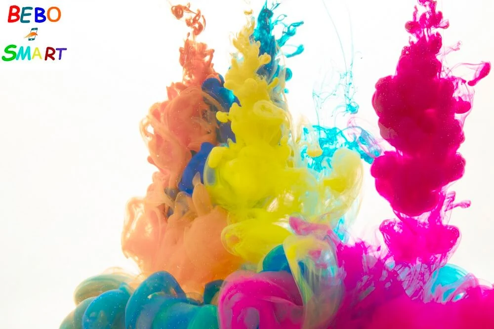
Brand colors are a palette of five to ten colors used to represent a particular company, and consistent and strategic use of brand colors can increase brand awareness.
Some of the main applications of brand colors include the company logo, website color scheme, social media channels, business card design, and print and digital ads.
Define your brand identity
Your brand colors are a reflection of your corporate identity, so your color palette should align with the values, goals, and messages you want to communicate.
For this purpose, you will first need to define your brand identity, and a recommended practice is to make a list of adjectives that describe your company's personality, as if you were talking about someone, ask yourself how you want the brand to be understood. What distinguishes it from the competition?
Discover the meanings of colors
Now that you've defined your brand personality, it's time to choose colors to make them shine, and in doing so it's worth looking into the principles of color psychology to learn the meanings of common colors.
However, it is also important to point out that color is not an exact science, there is no formula for determining exactly what color means, and this is where color combinations come in, as they help achieve a look that evokes certain emotions by being together.
Colors can mean different things depending on the colors they are associated with, as well as context and cultural connotations, however, there are clear trends in the use of colors based on the industry.
To help you choose the right color palette for your business, here's a quick breakdown of the colors of popular brands by a few key industries:
Food
Many food companies and restaurants choose warm colors that attract attention and arouse appetite, such as red, orange, and yellow, and other food brands choose green to enhance associations with nutrition and well-being or blue and pink for desserts and desserts.
Health and Wellness
Most health and wellness companies choose blue to denote cleanliness, trustworthiness, and responsibility. Other popular choices are green, which represents nature and vitality, and orange, which can evoke ideas of vitality and energy.
Fashion and Beauty
Black is often used by the fashion and beauty industries for sophistication and glamor, and warm colors like red, orange, and pink for passion, confidence, and excitement.
Technology
Tech companies often choose blue, which symbolizes confidence, intelligence, and efficiency, additional colors are orange, which is friendly and optimistic, and violet, which symbolizes quality and creativity.
looking for inspiration
As a final step before crafting your brand colors, find color inspiration, browse your competitors' websites, try to understand what makes them popular and good, and think about what you can learn from their color choices, and ways you can differentiate yourself from the competition.
Another great source of inspiration is our online color palette generators, where you can find ideas for exciting color pairs and charming shades, and you can also explore these logo color ideas for some inspiration.
Choose your base color
The base color of your brand is the color most closely associated with your company, so look for one color that best embodies your business based on the meanings of the colors.
You can also experiment with different shades and tints for the color you have in mind, from lush and dark to soft and pastel, or even bright neon, in order to find the perfect look.
Choose your secondary colors
Once you have the primary color, choose two to four colors that go with it. These colors will complement your primary color and can appear alongside or independently. Brand secondary colors can appear in several different directions:
Symmetrical color scheme
These are variants close to your base color, meaning that if your base color is a bright red, you can add other warm colors that belong to the same color family as orange and yellow, and similar color schemes are usually harmonious and pleasant in their appearance.
Monochromatic color scheme
These are the different shades and tints of a primary color, for example, if your primary color is blue, your secondary colors can be light blue and dark blue, and monochromatic color schemes can strengthen and enhance your primary color.
Contrasting color schemes
Contrasting colors are either complementary colors opposite each other, or a selection of equally vivid colors, this color scheme can help your brand colors pop and usually give you a sense of fun and modernity.
Select Neutral Colors
When crafting your brand colors, it's easy to focus on the main colors and overlook neutral colors, however, neutral colors are important because they are as responsible for most of your communication as the color of your written text and will appear in the background of most of your assets.
Neutral colors are usually white or black, often combined with a few shades of gray.
Test your brand's colors
Once you've chosen your colors, put them all together and test them out in a few different combinations to make sure they complement each other and convey the message you were aiming for.
To make your website easily accessible, you should also test the color palette to ensure that it is clearly legible.
There are plenty of online resources and browser plug-ins that test color contrast for accessibility for the best options.